Components overview
Components are the building blocks of your flows. Like classes in an application, each component is designed for a specific use case or integration.
Langflow provides keyboard shortcuts for the workspace.
In the Langflow header, click your profile icon, select Settings, and then click Shortcuts to view the available shortcuts.
Add a component to a flow
To add a component to a flow, drag the component from the Core components or Bundles menu into the workspace.
Components are grouped by type or provider, and some components are hidden by default:
-
Core components: Langflow's base components are grouped by purpose, such as Inputs and Outputs or Data. These components either provide generic functionality, like loops and parsing, or they provide single components that support multiple third-party integrations.
-
Bundles: Bundles contain one or more components that support specific third-party integrations, and they are grouped by service provider.
-
Legacy: These components are hidden by default. For more information, see Legacy components.
Configure a component
After adding a component to a flow, configure the component's parameters and connect it to the other components in your flows.
Each component has inputs, outputs, parameters, and controls related to the component's purpose. By default, components show only required and common options. To access additional settings and controls, including meta settings, use the component inspection panel.
Component inspection panel
When you select a component in the workspace, a component inspection panel appears on the right side of the screen.
The inspection panel displays all of a component's parameters, including hidden or advanced parameters.
Component header menus
To access a component's header menu, click the component in your workspace.

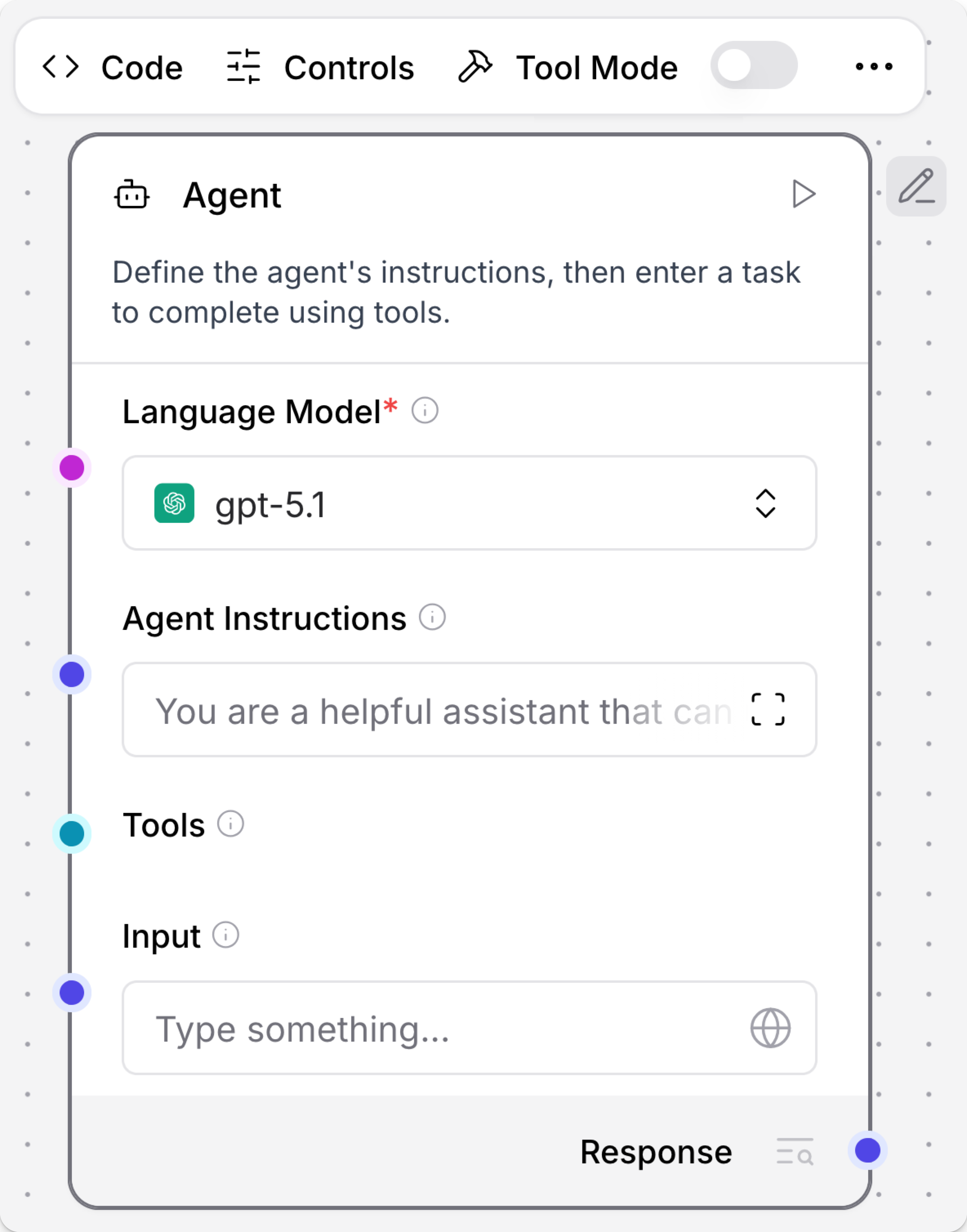
The following options are available directly on the header menu:
- Code: Modify component settings by directly editing the component's Python code.
- Freeze: Freeze a component and all upstream components to prevent re-running. For more information, see Freeze a component.
- Tool Mode: Enable this option when combining a component with an Agent component.
For all other options, including Delete and Duplicate controls, click Show More.
Rename a component
To modify a component's name or description, click the component in the workspace, and then click Edit. Component descriptions accept Markdown syntax.
Run a component
To run a single component, click Run component. A Last Run value indicates that the component ran successfully.
Running a single component is different from running an entire flow. In a single component run, the build_vertex function is called, which builds and runs only the single component with direct inputs provided through the visual editor (the inputs_dict parameter). The VertexBuildResult data is passed to the build_and_run method that calls the component's build method and runs it. Unlike running an entire flow, running a single component doesn't automatically execute its upstream dependencies.
Inspect component output and logs
To view the output and logs for a single component, click Inspect.
Freeze a component
Freezing a component also freezes all components upstream of the selected component.
Use the freeze option if you expect consistent output from a component and all upstream components, and you only need to run those components once.
Freezing a component prevents that component and all upstream components from re-running, and it preserves the last output state for those components. Any future flow runs use the preserved output.
To freeze a component, click the component in the workspace to expose the component's header menu, and then click Freeze.
Component ports
Around the border of each component, there are circular port icons like . These indicate a component connection point or port.
Ports either accept input or produce output of a specific data type. You can infer the data type from the field the port is attached to or from the port's color. For example, the System Message field accepts message data, as illustrated by the blue port icon: .

When building flows, connect output ports to input ports of the same type (color) to transfer that type of data between two components. For information about the programmatic representation of each data type, see Langflow data types.
-
In the workspace, hover over a port to see connection details for that port. Click a port to Search for compatible components.
-
If two components have incompatible data types, you can use a processing component like the Type Convert component to convert the data between components.
Dynamic ports
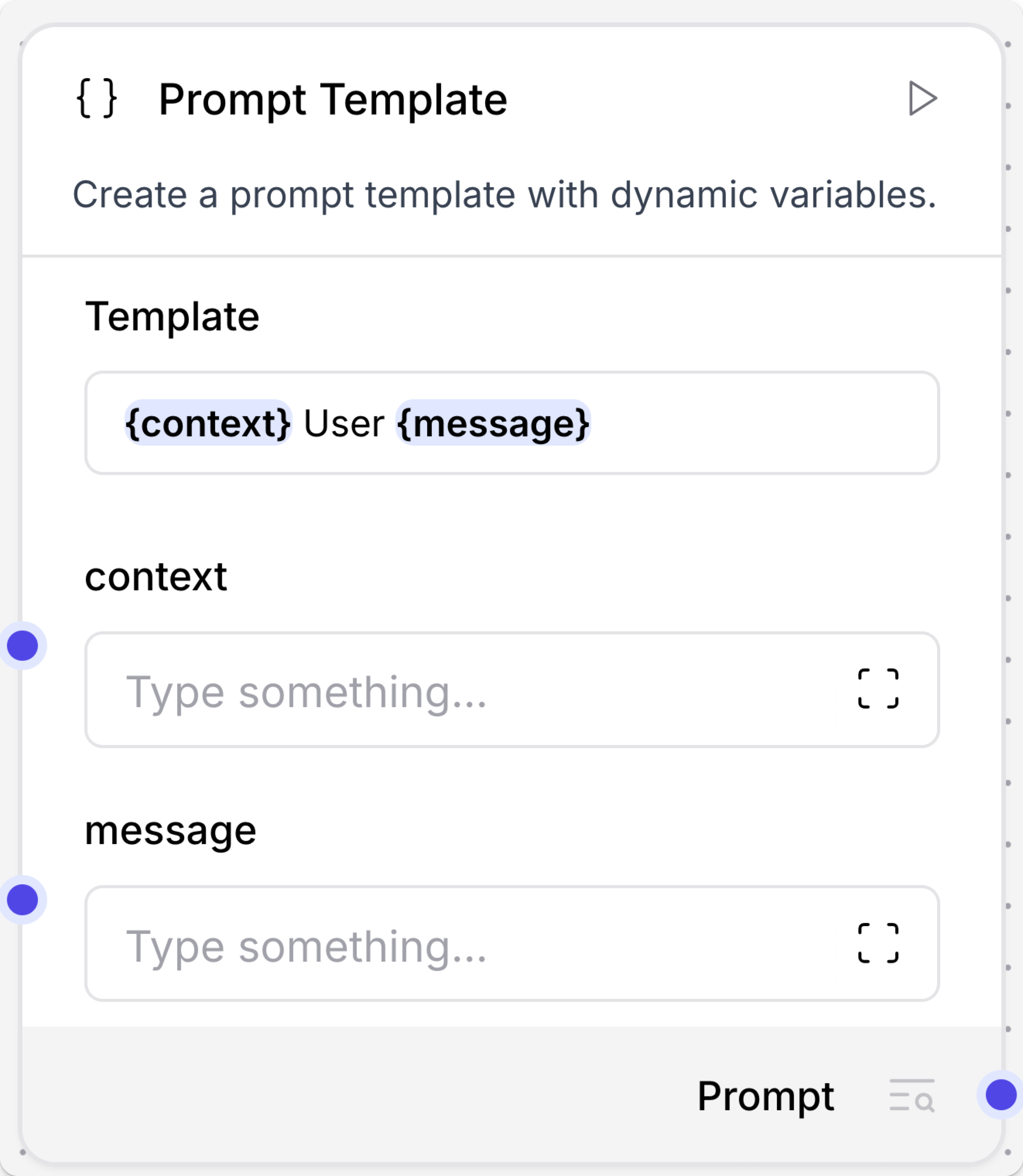
Some components have ports that are dynamically added or removed. For example, the Prompt Template component accepts inputs wrapped in curly braces, and new ports are opened when a value wrapped in curly braces is detected in the Template field.

Output type selection
All components produce output that is either sent to another component in the flow or returned as the final flow result.
Some components can produce multiple types of output:
-
If the component emits all types at once, the component has multiple output ports in the visual editor. In component code, this is represented by
group_outputs=True -
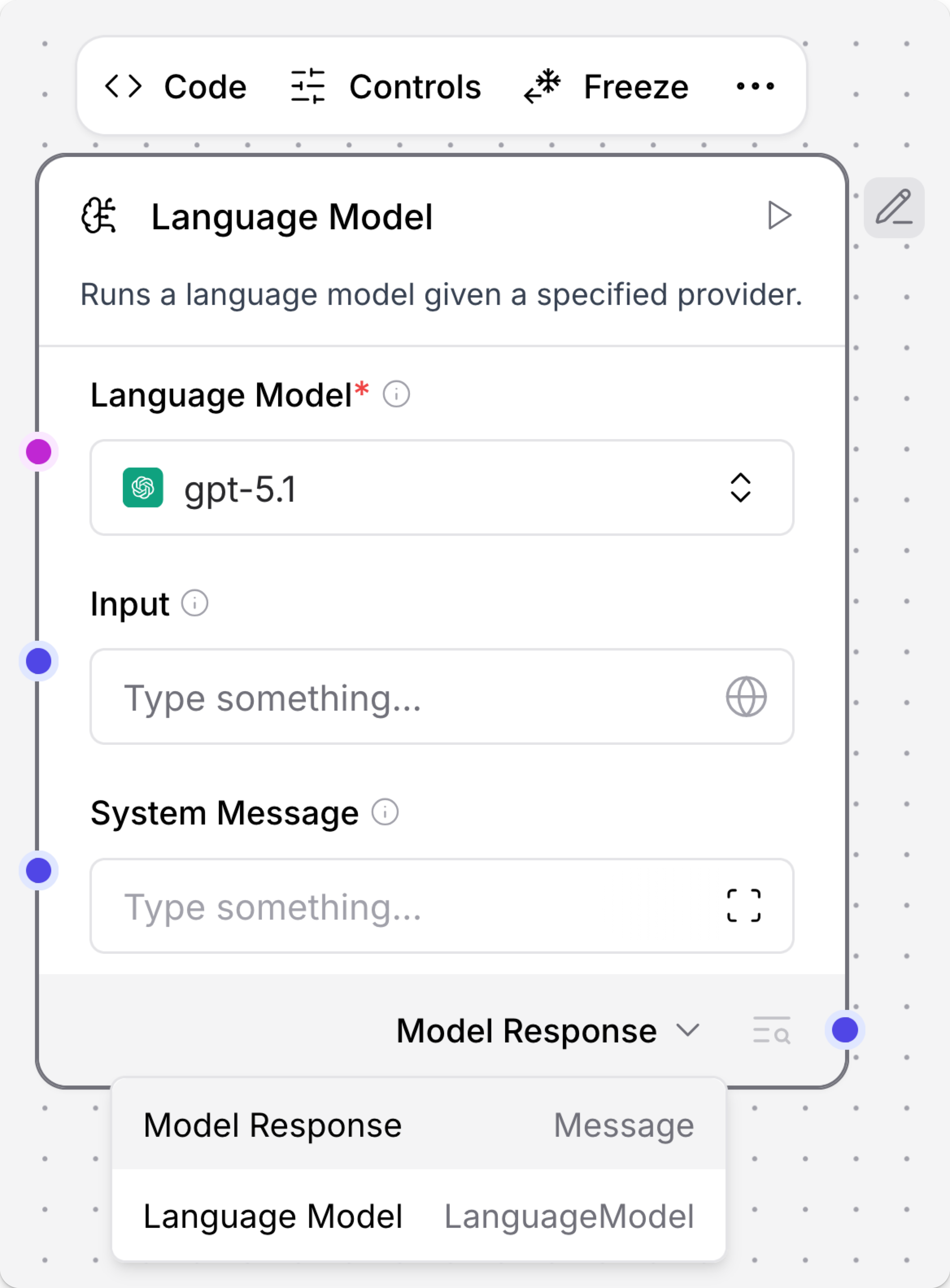
If the component emits only one type, you must select the output type by clicking the output label near the output port, and then selecting the desired output type. In component code, this is represented by
group_outputs=Falseor omitting thegroup_outputsparameter.
For example, a language model component can output either a Model Response or Language Model.
The Model Response output produces Message data that can be passed to another component's Message port.
The Language Model output must be connected to a component with a Language Model input, such as the Structured Output component, that uses the attached LLM to power the receiving component's reasoning.

Port colors
Component port colors indicate the data type ingested or emitted by the port.
For example, a Message port either accepts or emits Message data.
The following table lists the component data types and their corresponding port colors:
| Data type | Port color | Port icon example |
|---|---|---|
| JSON | Red | |
| Table | Pink | |
| Embeddings | Emerald | |
| LanguageModel | Fuchsia | |
| Memory | Orange | |
| Message | Indigo | |
| Tool | Cyan | |
| Unknown or multiple types | Gray |
Component code
You can edit components in the workspace and in code. When editing a flow, select a component, and then click Code to see and edit the component's underlying Python code.
All components have underlying code that determines how you configure them and what actions they can perform. In the context of creating and running flows, component code does the following:
- Determines what configuration options to show in the visual editor.
- Validates inputs based on the component's defined input types.
- Processes data using the configured parameters, methods, and functions.
- Passes results to the next component in the flow.
All components inherit from a base Component class that defines the component's interface and behavior.
For example, the Recursive Character Text Splitter component is a child of the LCTextSplitterComponent class.
Each component's code includes definitions for inputs and outputs, which are represented in the workspace as component ports.
For example, the RecursiveCharacterTextSplitter has four inputs. Each input definition specifies the input type, such as IntInput, as well as the encoded name, display name, description, and other parameters for that specific input.
These values determine the component settings, such as display names and tooltips in the visual editor.
Additionally, components have methods or functions that handle their functionality.
For example, the RecursiveCharacterTextSplitter has two methods:
The get_data_input method retrieves the text to be split from the component's input, which makes the data available to the class.
The build_text_splitter method creates a RecursiveCharacterTextSplitter object by calling its parent class's build method. Then, the text is split with the created splitter and passed to the next component.
Component versions
Component versions and states are stored in an internal Langflow database. When you add a component to a flow, you create a detached copy of the component based on the information in the Langflow database. These copies are detached from the primary Langflow database, and they don't synchronize with any updates that can occur when you upgrade your Langflow version.
In other words, an individual instance of a component retains the version number and state from the moment you add it to a specific flow. For example, if a component is at version 1.0 when you add it to a flow, it remains at version 1.0 in that flow unless you update it.
Update component versions
When editing a flow in the workspace, Langflow notifies you if a component's workspace version is behind the database version so you can update the component's workspace version:
-
Update ready: This notification means the component update contains no breaking changes.
-
Update available: This notification means the component update might contain breaking changes.
Breaking changes modify component inputs and outputs, causing the components to be disconnected and break the flow. After updating the component, you might need to edit the component settings or reconnect component ports.
There are two ways to update components:
-
Click Update to update a single component. This is recommended for updates without breaking changes.
-
Click Review to view all available updates and create a snapshot before updating. This is recommended for updates with breaking changes.
To save a snapshot of your flow before updating the components, enable Create backup flow before updating. Backup flows are stored in the same project folder as the original flow with the suffix
(backup).To update specific components, select the components you want to update, and then click Update Components.
Components are updated to the latest available version, based on the version of Langflow you are running.
Group components
Multiple components can be grouped into a single component for reuse. This is useful for organizing large flows by combining related components together, such as a RAG Agent component and it's associated tools or vector store components.
-
Hold Shift, and then click and drag to highlight all components you want to merge. Components must be completely within the selection area to be merged.
Alternatively, to select components for merging one by one, hold Ctrl on Windows or Cmd on Mac, and then click each component to add them to the group.
-
Release the mouse and keyboard, and then click Group to merge the components into a single, group component.
Grouped components are configured and managed as a single component, including the component name, code, and settings.
To ungroup the components, click the component in the workspace to expose the component's header menu, click Show More, and then select Ungroup.
If you want to reuse this grouping in other flows, click the component in the workspace to expose the component's header menu, click Show More, and then select Save to save the component to the Core components menu as a custom component.
Legacy components
Legacy components are longer supported and can be removed in a future release. You can continue to use them in existing flows, but it is recommended that you replace them with supported components as soon as possible. Suggested replacements are included in the Legacy banner on components in your flows. They are also given in release notes and Langflow documentation whenever possible.
If you aren't sure how to replace a legacy component, Search for components by provider, service, or component name. The component may have been deprecated in favor of a completely new component, a similar component, or a new version of the same component in a different category.
If there is no obvious replacement, consider whether another component can be adapted to your use case. For example, many Core components provide generic functionality that can support multiple providers and use cases, such as the API Request component.
If neither of these options are viable, you could use the legacy component's code to create your own custom component, or start a discussion about the legacy component.
To discourage use of legacy components in new flows, these components are hidden by default. In the visual editor, you can click Component settings to toggle the Legacy filter.